Button
Nomenclature
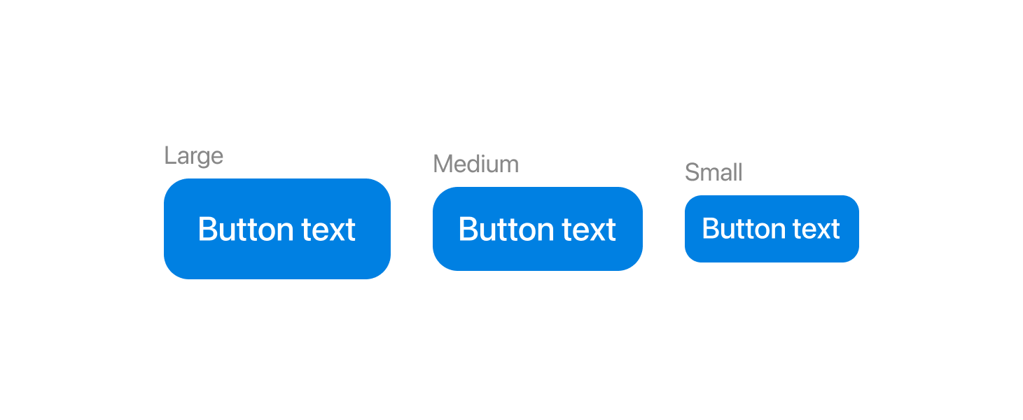
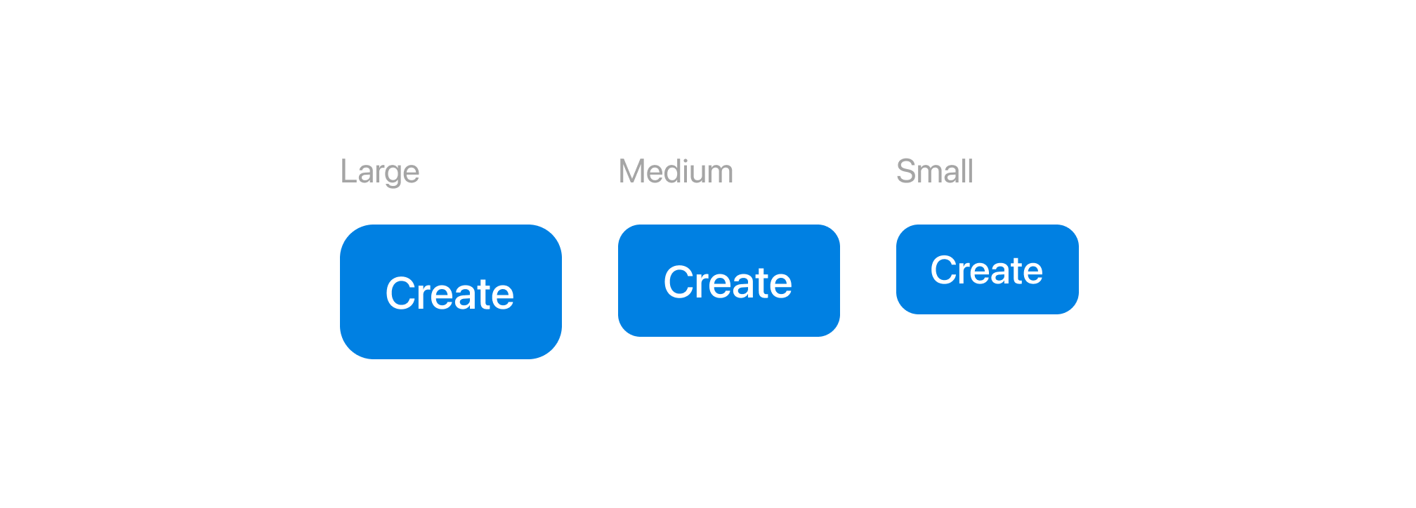
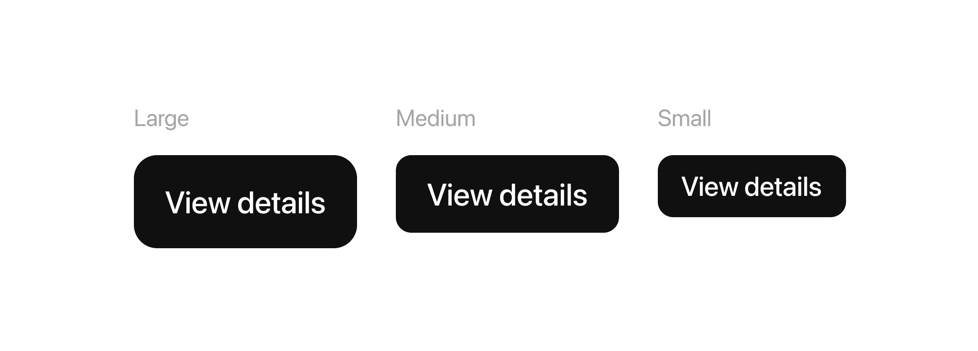
Size variables
Large
Best for primary actions that need maximum visibility. Ideal for hero sections, forms, or key call-to-actions where prominence is crucial.

Medium
Default button size for most interfaces. Works well for general actions like “Save”, “Next”, “Apply”, or “View Details”. Balances visibility with space efficiency, making it the most versatile option.
Small
Used for secondary or less critical actions, especially in dense layouts like tables, cards, or side panels. Great for actions such as “Edit”, “Filter”, or “More”. Primarily used in Mobile.
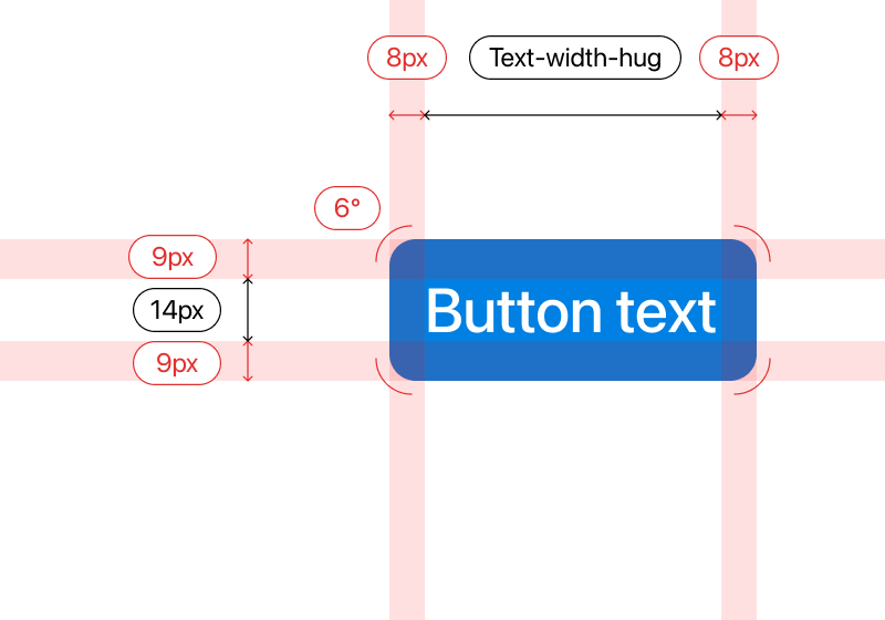

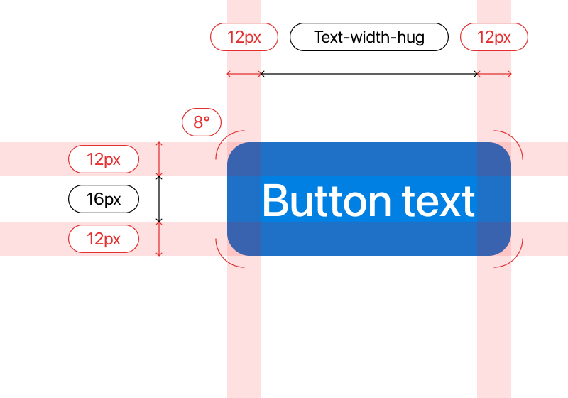
display: flex;
height: 48px;
left-right-padding: 16px;
top-bottom-padding: 16px;
align-items: center;
gap: 8px;
border-radius: 12px ;
background: #0080E2;

display: flex;
height: 40px;
left-right-padding: 16px;
top-bottom-padding: 16px;
align-items: center;
gap: 8px;
border-radius: 8px ;
background: #0080E2;

display: flex;
height: 32px;
left-right-padding: 12px;
top-bottom-padding: 12px;
align-items: center;
gap: 8px;
border-radius: 8px ;
background: #0080E2;

display: flex;
height: 48px;
left-right-padding: 12px;
top-bottom-padding: 16px;
align-items: center;
gap: 8px;
border-radius: 12px ;
background: #0080E2;

display: flex;
height: 40px;
left-right-padding: 12px;
top-bottom-padding: 16px;
align-items: center;
gap: 8px;
border-radius: 8px ;
background: #0080E2;

display: flex;
height: 32px;
left-right-padding: 8px;
top-bottom-padding: 9px;
align-items: center;
gap: 8px;
border-radius: 8px ;
background: #0080E2;

display: flex;
height: 48px;
left-padding: 12px;
right-padding: 16px;
top-bottom-padding: 16px;
align-items: center;
gap: 8px;
border-radius: 12px ;
background: #0080E2;

display: flex;
height: 40px;
left-padding: 12px;
right-padding: 16px;
top-bottom-padding: 16px;
align-items: center;
gap: 8px;
border-radius: 8px ;
background: #0080E2;

display: flex;
height: 32px;
left-padding: 8px;
right-padding: 12px;
top-bottom-padding: 9px;
align-items: center;
gap: 8px;
border-radius: 8px ;
background: #0080E2;

display: flex;
height: 48px;
left-padding: 16px;
right-padding: 12px;
top-bottom-padding: 16px;
align-items: center;
gap: 8px;
border-radius: 12px ;
background: #0080E2;

display: flex;
height: 40px;
left-padding: 16px;
right-padding: 12px;
top-bottom-padding: 16px;
align-items: center;
gap: 8px;
border-radius: 8px ;
background: #0080E2;

display: flex;
height: 32px;
left-padding: 12px;
right-padding: 8px;
top-bottom-padding: 9px;
align-items: center;
gap: 8px;
border-radius: 8px ;
background: #0080E2;


display: flex;
height: 48px;
left-right-padding: 16px;
top-bottom-padding: 16px;
align-items: center;
gap: 8px;
border-radius: 12px ;
background: #101010;

display: flex;
height: 40px;
left-right-padding: 16px;
top-bottom-padding: 16px;
align-items: center;
gap: 8px;
border-radius: 8px ;
background: #101010;

display: flex;
height: 32px;
left-right-padding: 12px;
top-bottom-padding: 12px;
align-items: center;
gap: 8px;
border-radius: 8px ;
background: #101010;

display: flex;
height: 48px;
left-right-padding: 12px;
top-bottom-padding: 16px;
align-items: center;
gap: 8px;
border-radius: 12px ;
background: #101010;

display: flex;
height: 40px;
left-right-padding: 12px;
top-bottom-padding: 16px;
align-items: center;
gap: 8px;
border-radius: 8px ;
background: #0080E2;

display: flex;
height: 32px;
left-right-padding: 8px;
top-bottom-padding: 9px;
align-items: center;
gap: 8px;
border-radius: 8px ;
background: #0080E2;

display: flex;
height: 48px;
left-padding: 12px;
right-padding: 16px;
top-bottom-padding: 16px;
align-items: center;
gap: 8px;
border-radius: 12px ;
background: #0080E2;

display: flex;
height: 40px;
left-padding: 12px;
right-padding: 16px;
top-bottom-padding: 16px;
align-items: center;
gap: 8px;
border-radius: 8px ;
background: #0080E2;

display: flex;
height: 32px;
left-padding: 8px;
right-padding: 12px;
top-bottom-padding: 9px;
align-items: center;
gap: 8px;
border-radius: 8px ;
background: #0080E2;

display: flex;
height: 48px;
left-padding: 16px;
right-padding: 12px;
top-bottom-padding: 16px;
align-items: center;
gap: 8px;
border-radius: 12px ;
background: #0080E2;

display: flex;
height: 40px;
left-padding: 16px;
right-padding: 12px;
top-bottom-padding: 16px;
align-items: center;
gap: 8px;
border-radius: 8px ;
background: #0080E2;

display: flex;
height: 32px;
left-padding: 12px;
right-padding: 8px;
top-bottom-padding: 9px;
align-items: center;
gap: 8px;
border-radius: 8px ;
background: #0080E2;